Digital Health Record
This project is centred on improving the referral process at STARS hospital in Brisbane. We worked in groups of six, closely collaborating with a doctor to develop a digital health product for STARS hospital.
Through 10 meetings with our client Dr. Joshi, we have developed a application that digitises handwritten text and seamlessly integrates it into the workflow of clinicians. This solution promises to streamline the referral process and document management practices.
Timeline
Team
August - October 2023 (10 weeks)
Front-end and Design (me), and Back-end (4 ppl)
Background
STARS Hospital is facing operation challenges
Currently, clinicians receive referrals in the form of handwritten paper records sent in via emails. The referral letter comes paired with a medical record of the patient, which can be sourced from different points of care. Upon reception of the referral and medical record, the clinician decides whether to admit or reject the patient. Every day, STARS hospital receives 1400 patient referrals, that’s 30000 pages of handwritten patients’ records buried among thousands of emails.
Problem
The extensive paperwork is an admin nightmare for clinicians.
Efficiency: Handwritten records take a long time to read and very difficult to search, information is very difficult to extract. It takes one full-time equivalent nurse and 2 hours of a doctor’s time everyday just to process.
Accuracy: Handwritten medical record is hard to read and easy to be misread. According to Victoria’s digital health roadmap’ white paper, there is a patient was mistakenly given 80 units of insulin, when 8 was actually prescribed.
Research and Analysis
Streamlining referral process and addressing email clutter are top priorities
In the initial meeting with the client, we inferred the demand from Dr. Joshi to convert handwriting to electronic text, to assist the throughput of referrals to STARS. However, a large issue that was also expressed was cumbersome forwarding of referrals through email. The client expressed that his inbox is unorganised and referral emails from nurses get cluttered in with other emails. The below quotes extracted below aided in the discovery of users’ needs.
Here's some clips from the interview transcript with Dr. Joshi.
Original Data
Data Analysis
“I have to read bloody 1015 pages of medical records. Handwriting I can't read half the time, and then come up to some conclusion but being like,...”
The need for digitised, readable text became apparent here. It is clear that the reading of scanned paper records with handwritten notes is a bottleneck and inconvenience.
“Every two hours and say I want to check this. You know, like we've got five empty beds, who can we fill them with, okay? The best thing would be by six or 7am in the morning. All the referrals that have come through as a syphoned...”
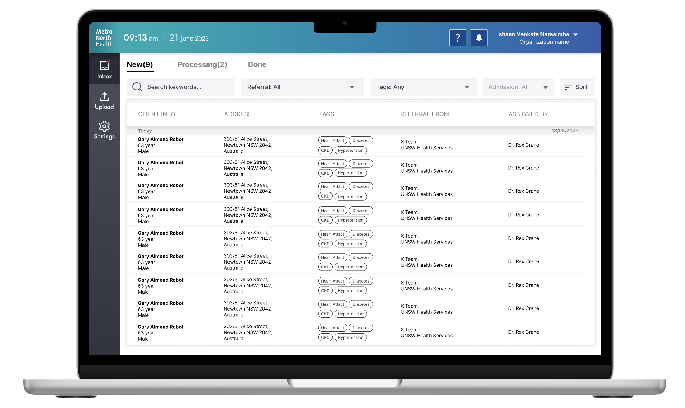
The current admission process involves manual checking for new referrals, prompting the need to organize and displaying them from most recent to last, with practitioners receiving notifications for new referrals.
This excerpt from the initial meeting further emphasises the need for a more time efficient referral process, and supports the analysis made previously.
“ They will call me every two hours got another referral? Can you imagine I've got like 50 clinic inpatient meetings, and every two hours talk about neuroscience. My attention is all over the place.
The insight is to set a focus on not only integrating character recognition technology, but also focusing on document management, which aids to streamline the referral throughput as a whole.
Design
Design on Inclusitivity and efficiency
Inclusivity is essential: The design should cater to a diverse user group. Considering that many doctors are older and may experience challenges such as poor vision, color perception, and low digital literacy, the design should be intuitive and straightforward for them.
Optimizing Doctor Efficiency: From the interview transcript, our client operate within tight schedules and aspire to maximize patient care capacity. Enhancing the efficiency of patient review through encorporating new layouts and processes would be very helpful, contributing to the reduction of stress for doctors and an improvement in the quality of patient care.
Final Screens
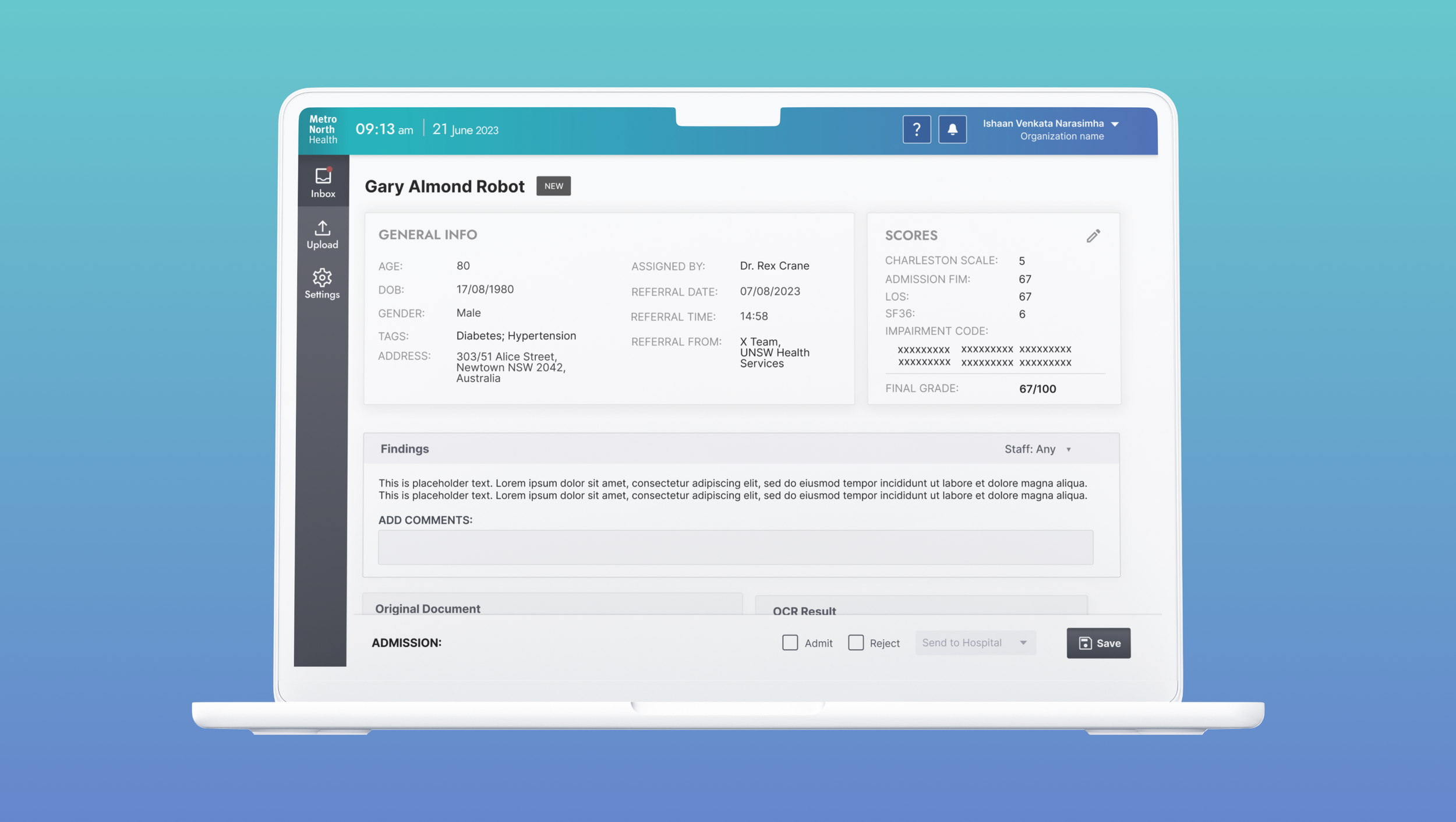
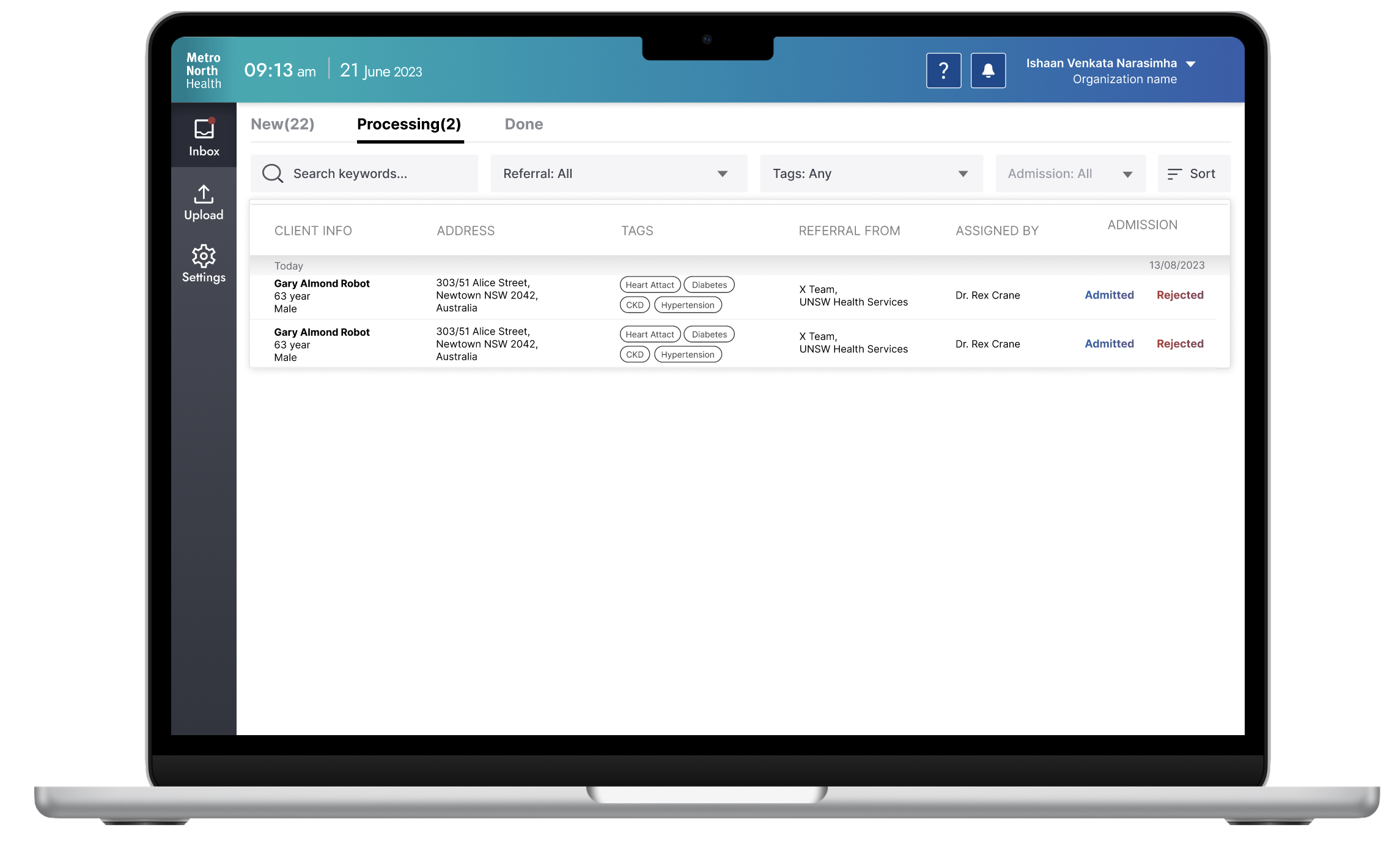
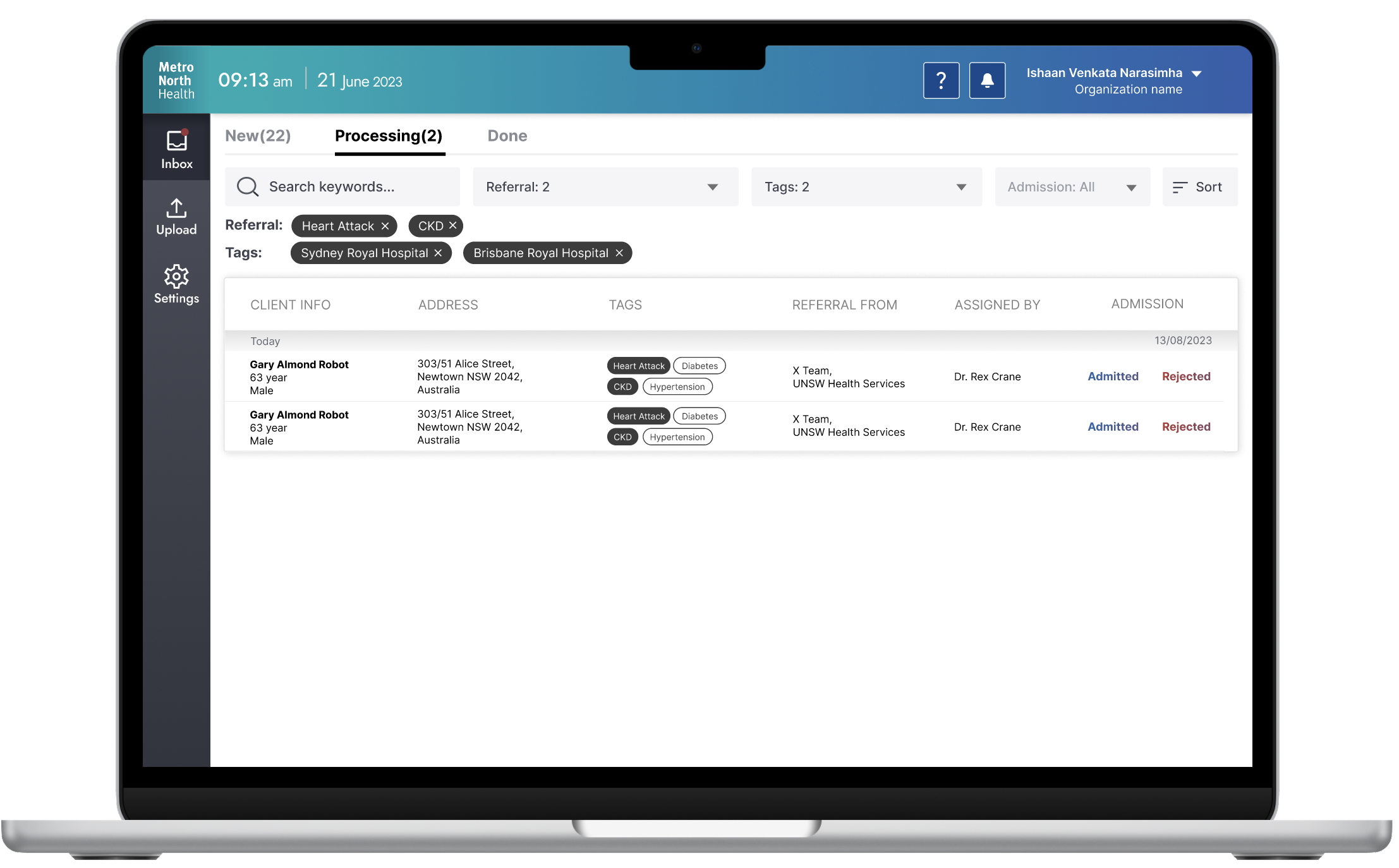
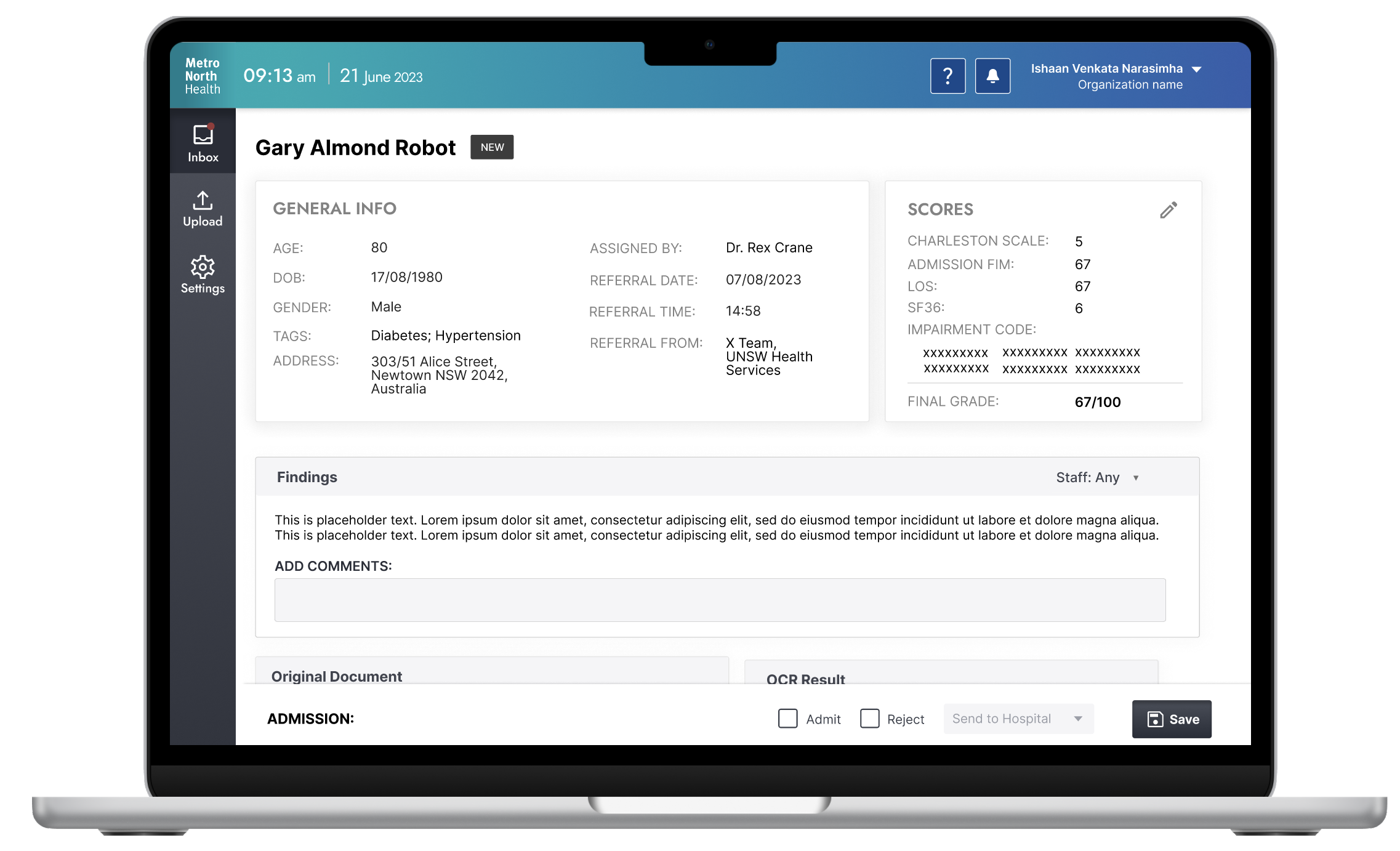
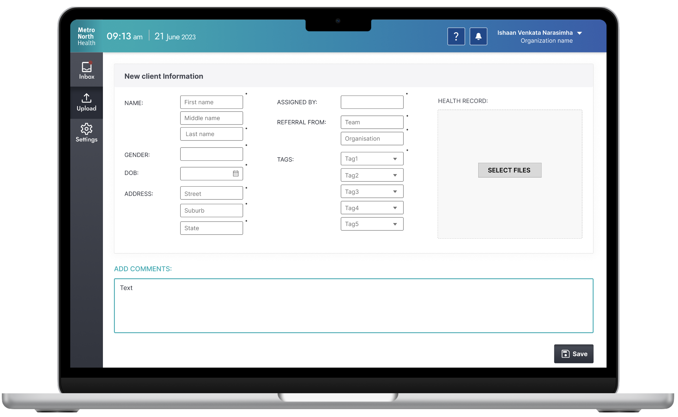
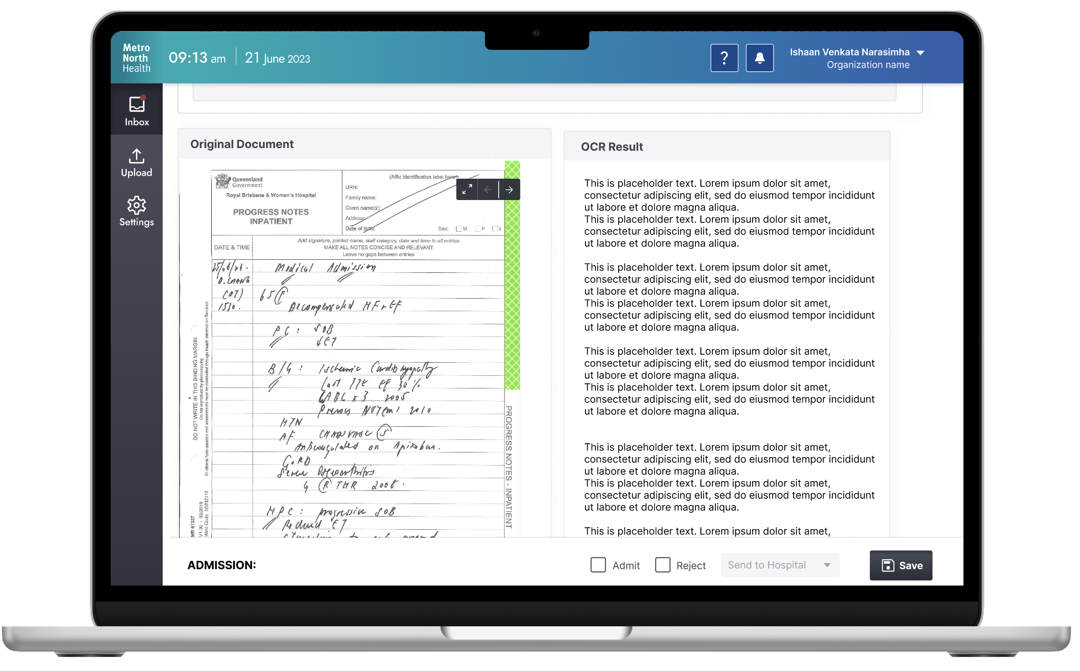
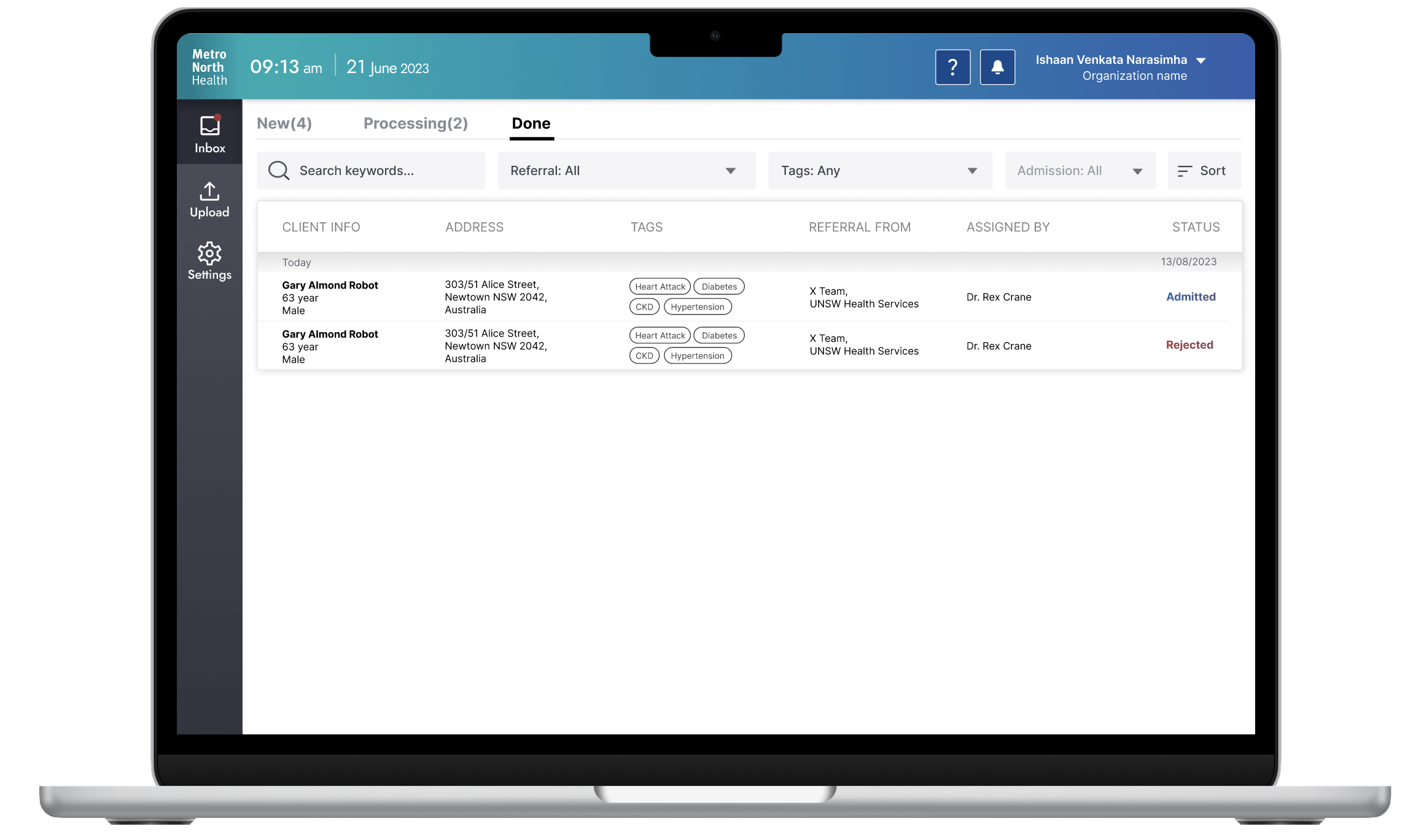
A Time-efficient application to digitize scanned referrals accurately.
User Test
Assessing navigation, referral decision and patient management
Tests were completed by asking the client to complete a task, and observing their behaviour and capability to complete the task. Here are some examples:
Navigation:
Ask the client to attempt to use tags to filter referrals listed on the landing page
Ask client to try and find the original referral form and the extracted text
Referral decision:
Ask the client to make a referral decision from the patient details page after inspecting the information, and from the ‘processing’ tab
Ask the client to change a referral decision from the patient details page and from the ‘done’ tab
Patient management:
Instruct the client to enter patient data, at least the required fields
Test result
The client expressed to be impressed by the system.
The results of the user testing demonstrate that the system’s navigation is intuitive and user-friendly, which meets the expectations. The system’s navigational capabilities enhance the overall user experience and usability, contributing to a seamless future integration of the product into the client’s workflow. The system facilitates the clinician’s decision-making process, and has the flexibility to change referral decisions. This functionality contributes to the streamlining of the referral process and improving the quality of patient care, while efficiently using the practitioner’s valuable time.
