QAGOMA Case Study
QAGOMA is a ticketing app allows users to book tickets from Gallery of Modern Art & Queensland Art Gallery in Brisbane.
Team:
Timeline:
April - May 2023 (3 weeks)
Solo project for Google UX Certificate
Problem
Dispersed information caused inconvenience
Current user flow:
User browsing on the website -> Places an order and makes payment -> Ticket sent to the email -> User saves the ticket image -> Arrives at the museum -> Presents the image.
Pain point: the user have to present tickets from the photos, make purchases/receive latest updates on the website, and navigate using maps along the way, causing inconvenience. Also, identical marketing emails lack appeal for users.
Solution
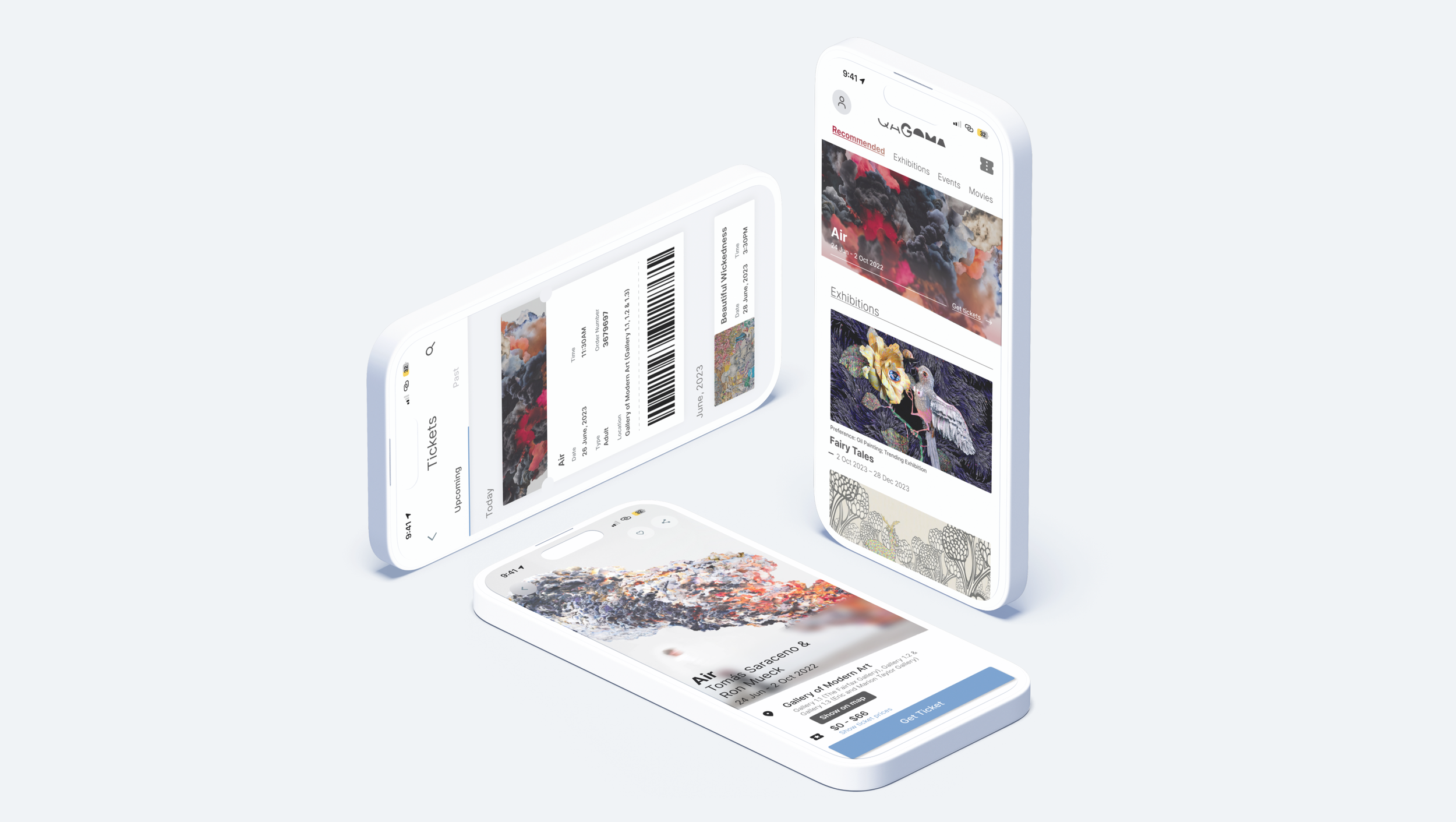
Integrated process with personalisation
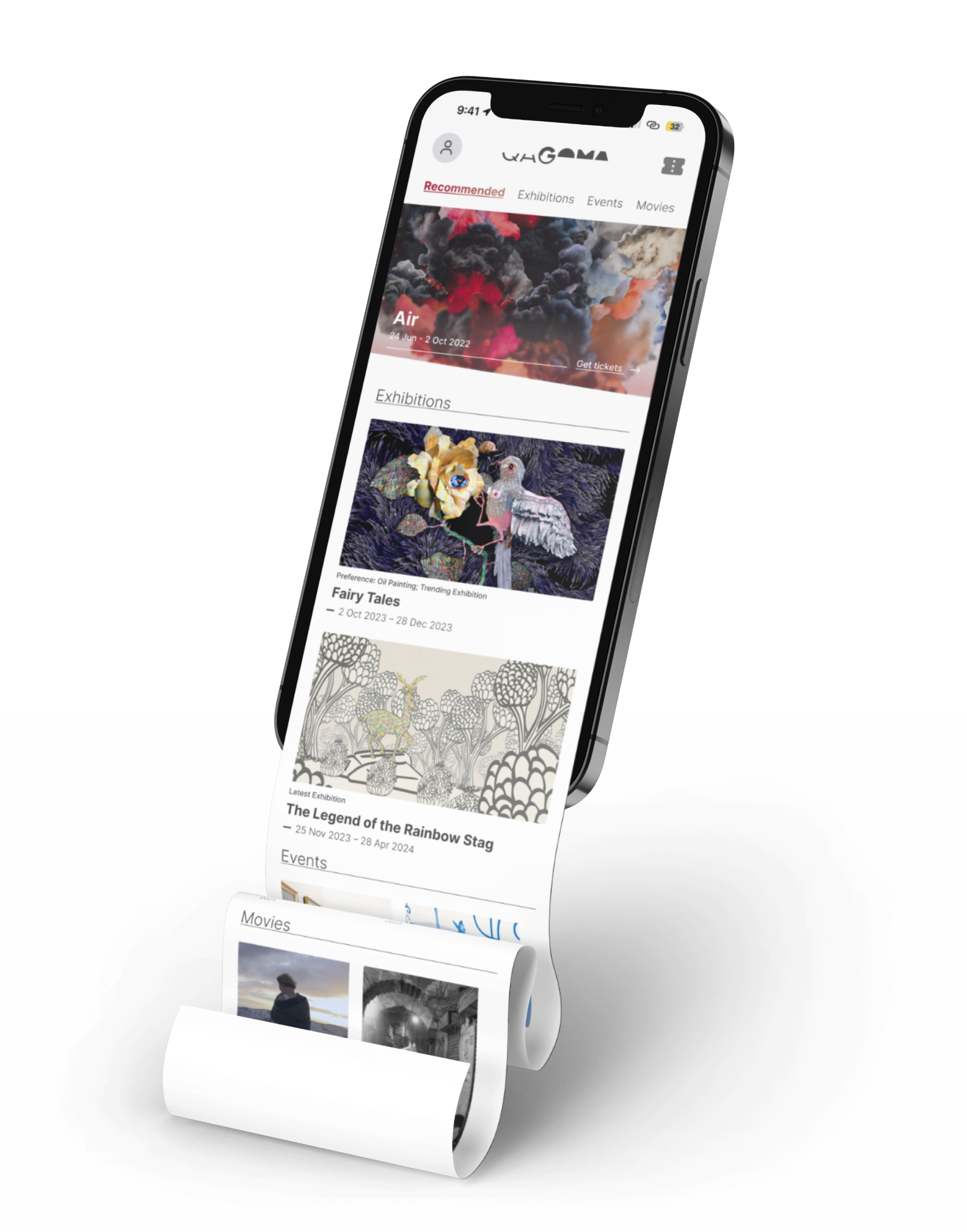
Recommended items based on history
Poster listed on the top for marketing purpose
3 sections stands for 3 main services that the gallery provides, evhibitions/events/movies.
Smooth ticketing experience in one app
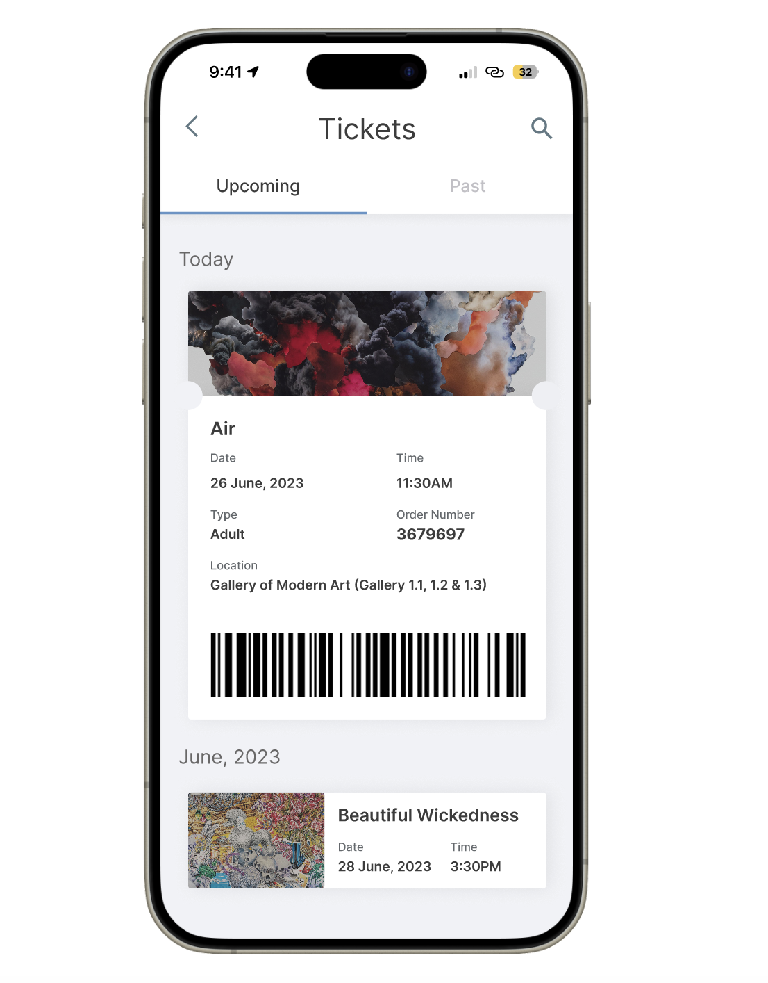
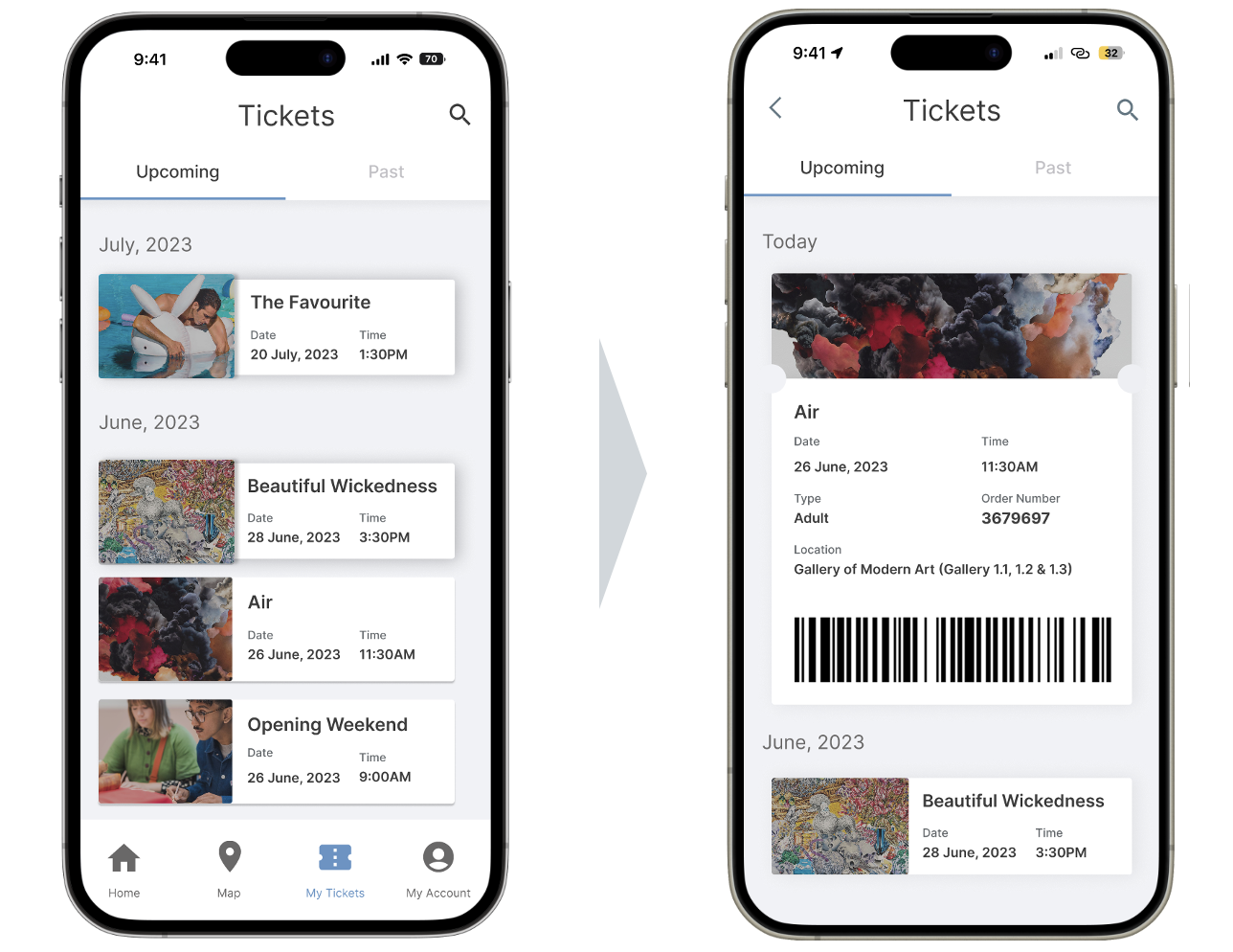
Users can purchasing, glancing events info and showing ticket bar code at the museum
Access ticket code in one click
User research
Primary Research through Observation and Interview
Observation: To gain empathy with the user, I purchased tickets and visited the museum, where I mainly observed the action of both elderly people and children. Interview: To understand user satisfaction with the current ticket booking system, we conducted 9 interviews with people who visit art museums at least once a month.
We focused our questions on the following two metrics:
Inclusivity for technology proficiency:
Does operation on multiple platforms confuse users, especially for elderly?
User's ability to book tickets for preferred events:
Is it challenging for users to find events/exhibitions they like?
Research Insights
Personalization and easily accessible information are the keys.
Trouble with locating information.
“I waste time with my mailbox trying to look for the QS code to enter my exhibition.”
“I am tired of transferring from my mailbox to the website and looking for information.”
Trouble with personalised option
“It take me a lot of time filtering works that lies on my field ”
“I love copy sketching, I want to know if there’s something that lies on my interest on. But it always took me a lot of time searching for the items”
Ideating
Features to address these needs
After reviewing and gaining insights from our research we moved onto iterating over the features. This would range from deciding the intended user-flow, addressing key pain points from our insights, and finally a system map to base the flow on.
Needs
Features to address needs
All purchased tickets and event booking in one App.
Home
Access all activities in the museum
Tickets
All Purchased tickets in one glace.
No click to access ticket QR code when time is near.
Personalised recommendations based on selection of interest and past history.
Home
Recommendation event and exhibition
Liked
Save your preferred activities.
Iterations
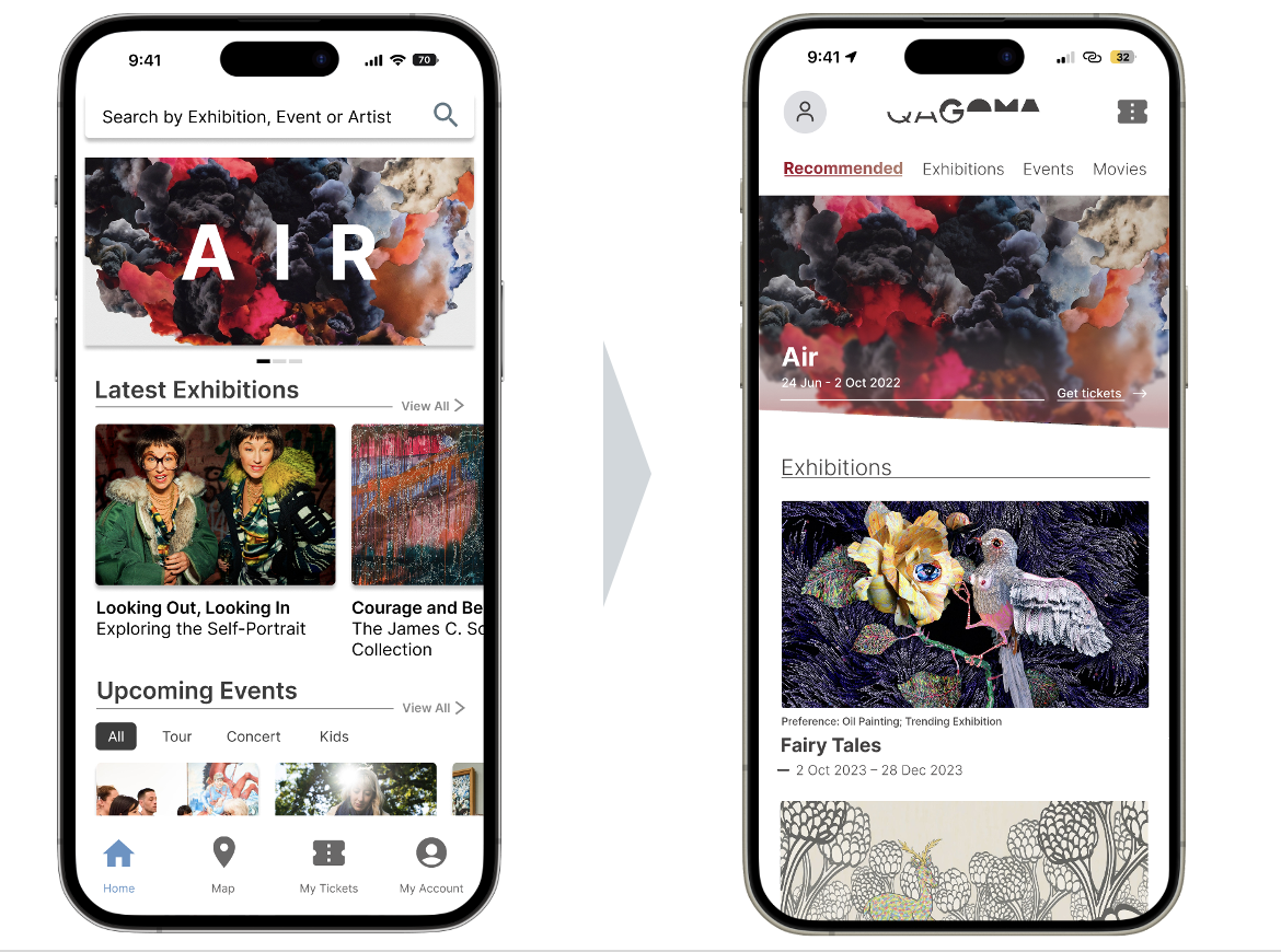
Major improvements in my design.
I created 4 iterations, focused on the major 3 milestones in the structure of my design.
Redesign filters
Due to the variety and number of events, I implemented a new filtering system on the landing page. This filter allows users to view events/exhibitions based on multiple conditions, helping them choose the best event that aligns with their availability.
Removal of bottom navigation
The key function of the application do have a very clear story line, from glancing the recomendations to ordering, from purchasing to show the bar code to the gallery staff. Therefore, we can show the user the screens that is the most related to the beginning of this process and guide the user along the way, finally let the user explore the other parts naturally.
Displaying ticket
On the day of the booked time, the ticket will automatically expand to reveal the barcode. Most of the time, only one exhibition requires a ticket for entry, and the majority of events are free entry, so there is no need for user to make an extra click.
Reflection
I’ll do these next time
Generally, this is my first ever UX project. I’ve gone through the entire product development process navigated by the Google UX Bootcamp:
What I have learnt:
Data Collection and Analyzation: I tried multiple ways to collect data, including probe, survey and casual chat, and analyzing them to create problem statements.
Problem Solving: I formulate solutions to the problems, utilising ideation methods like 6 thinking hats and BACE.
Design Thinking: I got exposure to the entire product design process, and gaining a good understanding of each step.
What I’ll do differently:
Avoiding leading questions!
This is extremely important for me because there were times I was jumped in to the conversation with my interviewee so smoothly and forgeting about I was interviewing him…
Questions can be even more open-ended.
Like rather than asking do they enjoy/dislike something, asking about their experience using something so far, or to tell the story about using something/last time they used something.
Dont’t just focusing on what they said!
Observing carefully, and try to went beyond the words from their mouths. Remember to take more detailed notes.
More Observation!
It seems like a good idea to observe the location at different times and days, maybe we can get a different result and some interesting findouts.
